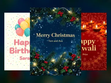
Made with this app









This app puts Ideogram V4 to work on the one thing it does better than any other model in the Arteza lineup: rendering crisp, accurate, stylistically intentional text inside images. Designers, marketers, and content creators who need posters, logos, social banners, event flyers, and typography-driven visuals will find a direct path from a written description to a finished, print-ready concept. A selectable speed range from Turbo to Quality gives you control over how much render time to trade for maximum detail.
How to use this app
- 1
Describe what you want to create, or upload your source file.
- 2
Pick your options, then press Generate.
- 3
Watch your result appear in the gallery within moments.
- 4
Download, share, or generate again with a new idea.
What you can make
Event Poster Design
Concert flyers, conference banners, and festival posters all depend on readable headlines layered over striking visuals. Ideogram V4 handles date lines, venue names, and headline text without the garbled letters that plague other models, producing share-ready concepts in a single generation.
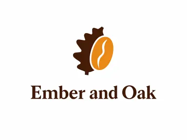
Logo Concepting
Brand teams can prototype wordmarks and badge-style logos by describing the letterform style, color palette, and icon relationship. Because text rendering is best-in-class, the output reads cleanly enough to hand directly to a vector artist as a reference without a round of manual corrections.
Social Media Marketing Assets
Promotional graphics that carry a discount code, a product name, or a call-to-action phrase need pixel-accurate typography. Ideogram V4 embeds that copy legibly into the composition, reducing the need for post-production text overlays in external tools.
Packaging and Label Mockups
Product teams exploring label directions can generate realistic mockups showing brand name, flavor or variant copy, and tagline in context. The Quality speed tier is worth the extra render time when evaluating fine typographic details at packaging scale.
Infographic and Data Callout Visuals
Short-form data visualizations, stat callout cards, and annotated diagrams benefit from a model that keeps numbers and labels intact. Ideogram V4 preserves numeric strings and short phrases accurately, making it useful for editorial and presentation graphics.
Prompt ideas to try
Why creators use this app
- Strongest text rendering
- Posters and logos
- Turbo to Quality speeds
- Marketing-grade
Tips for better results
Spell Out Text Exactly
Write every word, number, and punctuation mark you want to appear in the image inside quotation marks within your prompt. Ideogram V4 treats quoted strings as typographic targets, which significantly improves accuracy compared to paraphrased descriptions.
Use Quality Speed for Detail Work
The Quality tier takes up to 20 seconds but resolves fine letterforms, tight kerning, and small supporting text far more reliably. Reserve Turbo for quick concept validation and switch to Quality before finalizing any asset that will be shared or printed.
Describe Layout Before Style
Lead your prompt with compositional information such as headline at top, subtext centered below, icon in lower right before moving to color and mood. Ideogram V4 responds well to spatial instructions, producing more intentional typographic hierarchies.
Name the Typography Style Specifically
Terms like condensed sans-serif, slab serif, hand-lettered script, or Art Deco display type guide the model toward recognizable genre conventions. Vague terms like nice font yield inconsistent results, while genre-specific labels anchor the output to a coherent visual system.
When to choose this app
Pick this app when the image must contain readable text, whether that is a product name on a label, a headline on a poster, or a tagline on a banner. Sibling apps like Seedream 5.0 Pro and FLUX.1 Dev produce excellent photographic and painterly imagery, but neither was built around typography accuracy the way Ideogram V4 was. If legible, well-placed text inside the image is a core requirement rather than a secondary element, Ideogram V4 is the right tool.
Frequently asked questions
How many words of text can Ideogram V4 accurately render in a single image?
Short phrases and single lines of up to roughly eight to ten words tend to render most reliably. Longer body copy or multiple distinct text blocks become harder to control. For complex layouts, consider generating sections separately or keeping each text element brief and clearly described in the prompt.
Can I control where text appears in the composition?
Yes. Describe the position explicitly in your prompt using terms like headline at the top third, subtext centered below the illustration, or tagline along the bottom edge. Ideogram V4 responds to spatial layout instructions more consistently than models not optimized for typographic design.
Is Ideogram V4 suitable for generating logos I can use as final artwork?
It is excellent for logo concepting and mockups. For production use, the raster output typically needs to be traced into a vector format by a designer. Think of generations as high-quality references that communicate direction clearly, rather than files you would send directly to a printer.
When should I choose Turbo speed versus Quality speed?
Use Turbo when you are iterating quickly through prompt variations to find the right composition or color direction. Switch to Quality once you have a promising concept and want the sharpest possible letterforms and fine detail, especially for anything that will be reviewed by a client or shared publicly.
Does the model handle non-English text or special characters?
Ideogram V4 can attempt non-Latin scripts and special characters, but accuracy drops outside standard Latin alphabet typography. For multilingual marketing assets, test the specific characters you need at Quality speed and verify output carefully before building downstream work around the result.
What image styles work best alongside the text rendering capability?
Flat design, bold graphic illustration, poster art, and clean product mockup styles complement the typographic strength well because they share the same high-contrast, intentional compositional logic. Heavily photorealistic or painterly prompts can work but sometimes create tension between the rendered text and the background texture.
How much does it cost?
Each generation costs 3 credits. New accounts get free credits to try it out.
Which AI model powers this app?
This app runs on Ideogram V4, available through Arteza with no separate account or setup.
Can I use the results commercially?
Yes. Content you generate is yours to use, subject to our content licenses.
How long does a generation take?
Most generations finish in under a minute, and you can watch progress live in the gallery.